I met Anu online not long after starting AP&C close to two years ago, take aside that she’s such a lovely and warm person, she does a great edit of Nordic design which she shares on her beautiful blog Decordots. All of the seriously pinworthy images that she shares are found after her self confessed hours and hours of scanning through interior websites and magazines. Recently I noticed a lovely coloured wall in her home on her Instagram feed so I thought it might be fun if she wouldn’t mind sharing what she has hanging on it with us today. Please welcome Anu and all the way from Estonia!
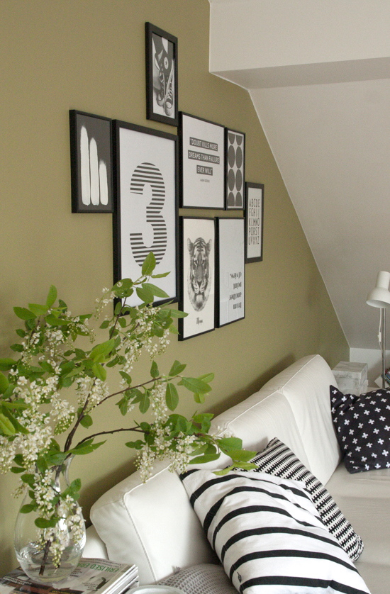
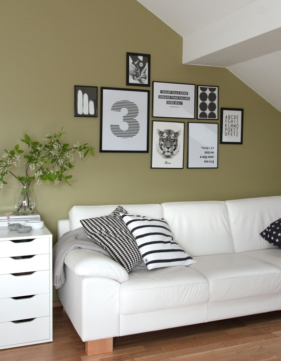
I live in a top floor apartment and my living room has sloped ceiling so wall space is quite limited. Fortunately there is enough space for a gallery wall behind the sofa and this is the corner of my home I’d like to share with you!
The wall behind the couch is painted in darker shade of greyish green and it’s the only colorful wall in otherwise white living room. There are actually two reasons for that. First, this wall is opposite to the big south-facing floor to ceiling window and I’m afraid that if the wall would be white it would be too bright for eyes when sun is out. Second, I like the contrast between darker wall and white furniture.
Because of the colorful background I have kept the collection of prints on the wall black and white. I love simple and minimalist Scandinavian style so the graphic black and white theme on my wall reflects my aesthetics.
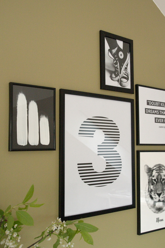
I like to change things often, but these are currently on my wall (from left to right and up to down):
- White brush strokes on black background are drawn by me. This is actually the simplest drawing I have ever made and I did it in two minutes while I was painting our kitchen shelves.
- The big number 3 print is there because our little family has 3 members right now.
- The black and white photo of feet in sneakers is from unknown photographer.
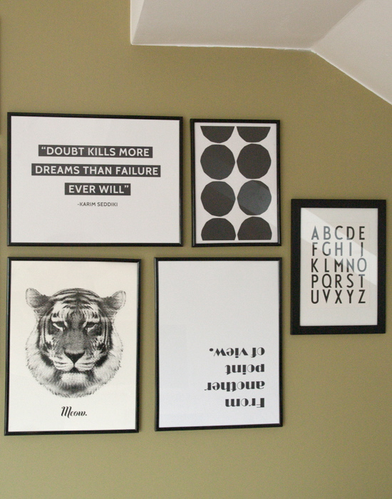
- The quote “Doubt kills more dreams than failure ever will” from Karim Seddiki is one of my favorites right now and I printed it out in hope that when I see it every day hanging on my wall I’ll have more courage to do things that are out of my comfort zone.
- Tiger says Meow print by Riikka Kantinkoski.
- The fragment of Maija Isola’s legendary Kivet pattern for Marimekko. I like this simple and graphic pattern so much, that it has found a way to my wall!
- “From another point of view” print is there because I didn’t want my wall to look too serious and at the same time it reminds me to look things at different angle and find new opportunities.
- The last one is famous typography by Arne Jacobsen, it’s actually a cut out from a package of Design Letters teatowels – it looked just too pretty to throw it in a trash bin!
I hope you enjoyed and thank you, Mel for having me over at your lovely blog!
Thank you so much Anu!
I’m seeing so many talented bloggers that really need to start selling some of their work lately. After receiving these photos from Anu, and seeing her “brushstroke” painting, I told her that she needs to start an online shop, I’m sure they’d be really popular and apparently there’s more!
I hope that you join me in following Anu and the Decordots blog for some gorgeous Nordic inspiration on the following channels:
Blog | Pinterest | Facebook | Twitter | Instagram
Mel xx
All images by and courtesy of Anu of DecorDots


Hi Anu, nice to meet you.
I share the sloping ceiling dilemma with you…
I also like the colour you’ve used to paint the wall.
Those chucks and B/W prints stand pout really well. Thank you for sharing part of your space.
Thanks Mel, love your series x
You girls are calling the sloping ceiling a dilemma, I call it charming! M xx
Thank you all for your lovely comments and positive feedback! :) It made me smile!
The prints look fabulous with the greenish background Anu. I love the picture of the sneakers and how you’ve placed them on the wall. Thank you for showing us this part of your lovely home.
Love the converse picture also! Have a great weekend Catherine xx
Hi Mel and Anu, what a fun post! Thank you for sharing this part of your gorgeous home, Anu. The different point of view print on the wall is great! The light in the room seems so pure and bright too! Heading over to Decor Dots now :) Jocelyn x
Love that print too Jocelyn, it makes me smile. M xx
Hi Mel, what a beautiful post. Thank you for introducing me to Anu’s beautiful home. I love the different prints on her wall. I’m on my way over to her blog right now for even more inspiration, before reading some BYW posts. Take care Mel :) and to Anu, you’ve got an amazing eye for putting prints together and creating prints yourself. I can only agree with Mel, you should start an online shop :)
She does a fab job of putting the prints together, I agree! Thanks Charlotte. M xx
I like the contrast of the black and white prints as well as the furniture against the gray-green wall. I have a wall that is similar in color, and it really makes my living room dark, so in a bright room, I can see why she wanted it painted a darker shade. A good lesson in painting rooms for light control & contrast. I’m pinning this room!
BTW I love her blog it’s on my list that I check regularly.
Hi Cyndi, so glad I could introduce Anu’s lovely blog to you! M x
Pingback: decordots: Inspired by Krista Keltanen
Mel, thank you again for asking me to be part in this series and for your kind introduction! It was such a pleasure to share this corner of my home! x
And such a gorgeous space and I really love the slope of the ceiling. I think you need to do a little house tour for Decor Dots! Thank you so much again. M xx
I know, I should have done that already… But as a perfectionist I find always something that needs to be done or changed before I share my home. I think I must get over it! And soon :)