Photo by Jane Ussher and courtesy of NZ House & Garden magazine
Last Thursday I attended the NZ House & Garden Interior of the Year Awards, a prestigious interior award here in New Zealand that judges in single room categories. Entries are open to the interior designers and the public and a great opportunity for those that might not have tackled every room in their home, but have one that they’re particularly proud of. This year there were almost four hundred entries, so making it to the final twenty is a big deal! Today I’m sharing a small taste of some of these from the November issue of NZ House & Garden.
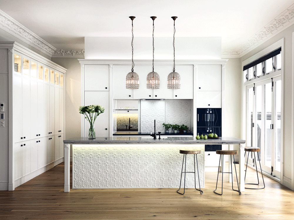
I’ll start with the kitchen and supreme winner, designed by Natalie du Bois, which definitely has a lot of wow quality. The room is a new extension to a home from the early 1900’s and while the owners wanted a modern look, they wanted to respect the home’s heritage. Natalie achieved this by ornate cornices and pressed tin, which works beautifully in this large light filled space. Something that I found ingenious and I’ve noted for the future, is how the rear splashback slides to the side to reveal a hidden laundry and larder. This feature allows them to easily share appliances.
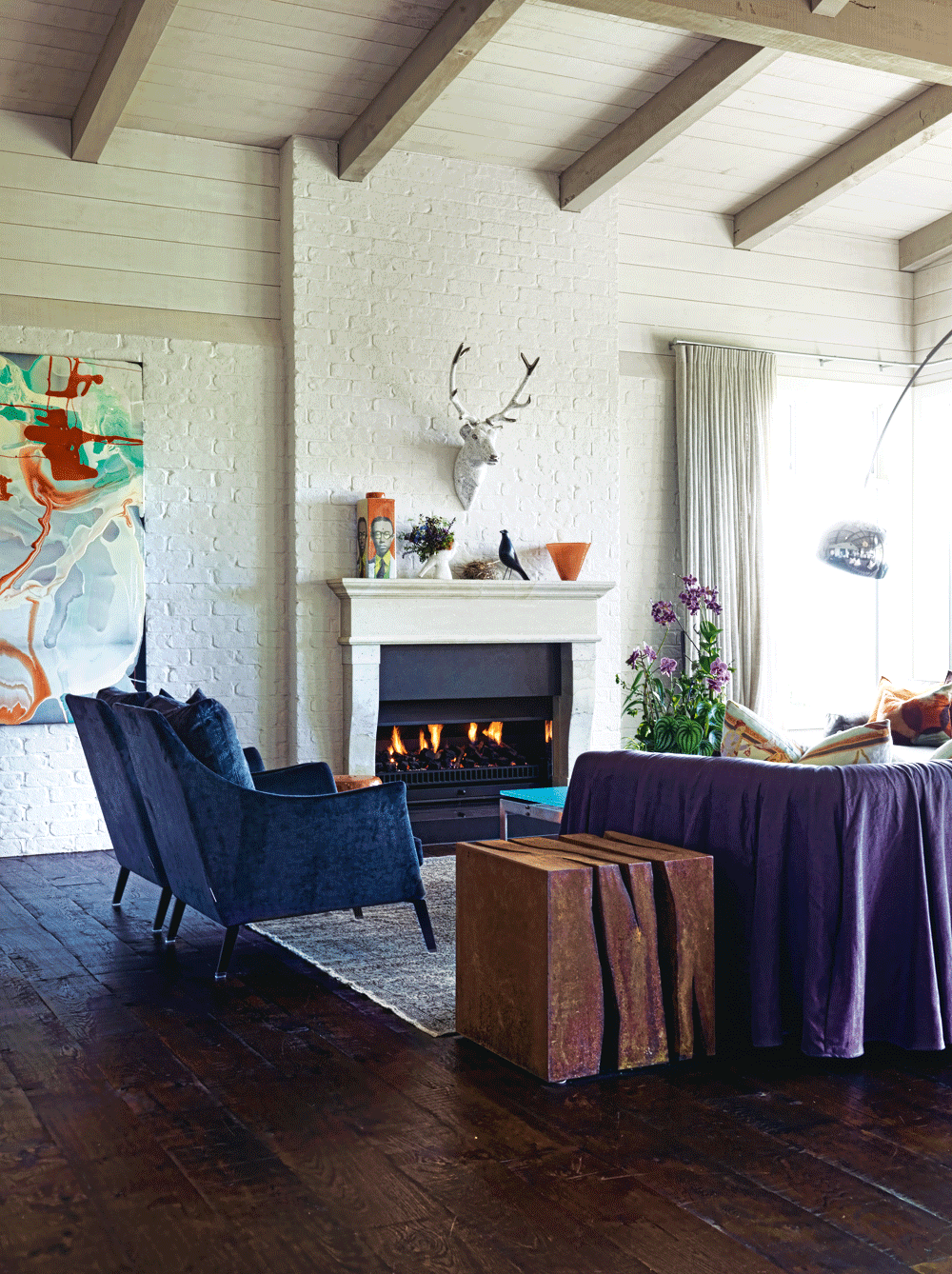
Photo by Jane Ussher and courtesy of NZ House & Garden magazine
The winner in the living room category is Cathy Gould, who built a home in the beautiful Matakana region and with a goal to create a contemporary barn feel. She certainly achieved it. I adore the mix of wood, open beams and painted brick, something that I don’t think we see enough of on this side of the world. The large volume also allows the owners to showcase their extensive art collection and contemporary furniture. Cathy’s entire and beautiful home can be seen in this same issue.
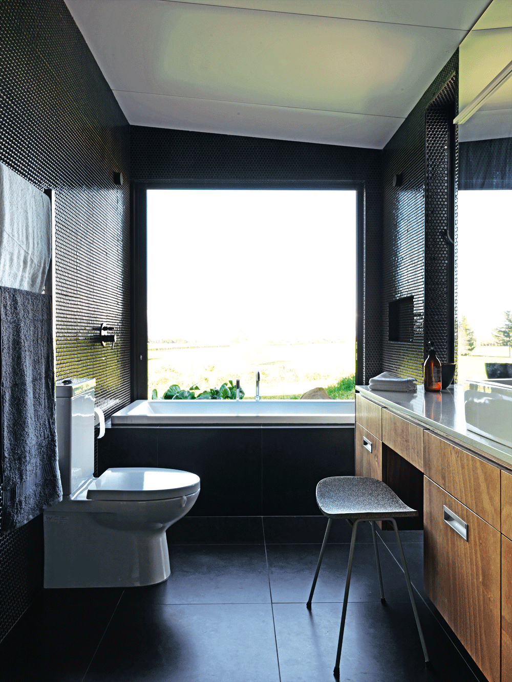
Photo by Jane Ussher and courtesy of NZ House & Garden magazine
You always get me at a bathroom and I had to include two here. The first was a finalist in the awards and belongs to Delwyn Clayton-Green. The idea of a bath by a huge window overlooking the countryside is a dream for me, not to mention one that slides open so that you feel at one with nature! I also love how they mixed large floor tiles with the penny wall tiles and the wood cabinetry against the black, gives such a sophisticated feel.
My Sydney bathroom felt like it was the size of a cupboard and there were huge challenges in making use of the space. With this in mind, I was particularly interested in how Nicola Manning Design literally turned a cupboard into a guest bathroom. I like how the rules were broken and lots of colour and pattern were used as a statement in this winner of the bathroom category.
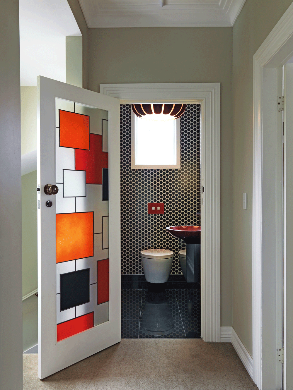
Photo by Jane Ussher and courtesy of NZ House & Garden magazine
The winner in the creative space category goes to homeowners, Jane and Hamish Peddie who are also the architects. I love the combination of wood, concrete in this Scandinavian/Alpine hut inspired home. The clever design, which was built on a small budget, sees a kitchen sitting in the wall of a mezzanine. There was also a lot of thought during the process, salvaging offcuts to be reused in other areas like the kitchen’s cedar feature panel, which was used in the outdoor cladding.
Do you have any favourites here? Make sure you check out the November NZ House & Garden magazine for the full report of the twenty finalists, which hits the stores and Zinio this week.
Mel xx
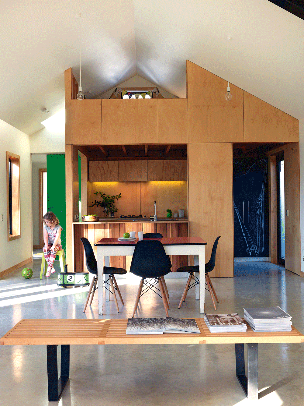
Photo by Jane Ussher and courtesy of NZ House & Garden magazine

