Design
Furniture by Decade | 1960’s
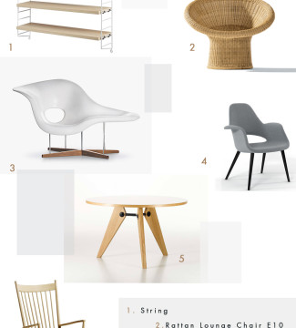
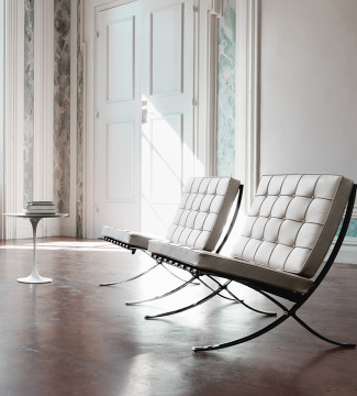
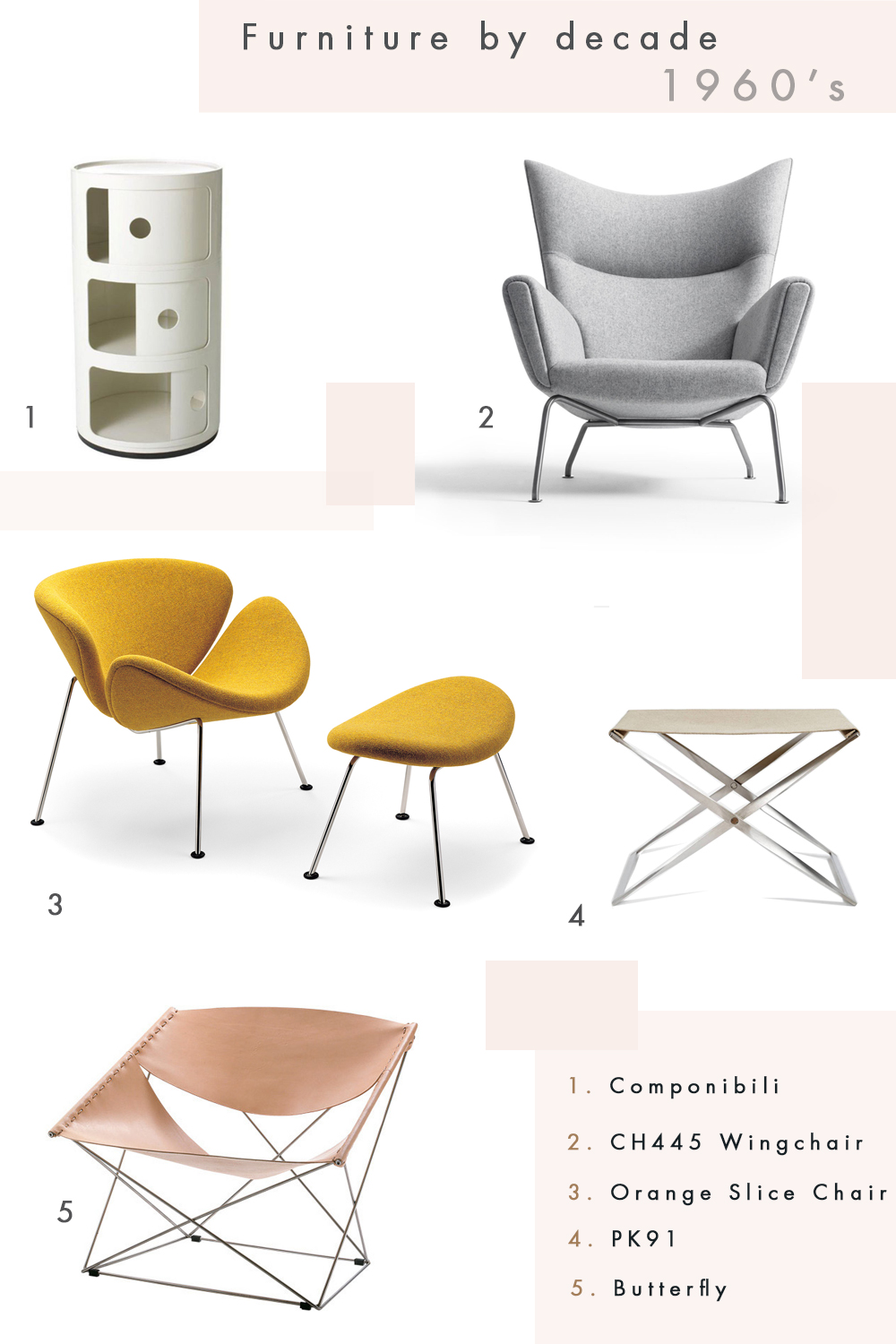 Carrying on with my furniture by decade series, I’m looking at my favourites from the 1960’s. There was actually quite a lot from this decade that I would have liked to have added, think the Mushroom chair, The EJ 605 Corona and the CH07 to name a few. However, if I must choose, here they are…
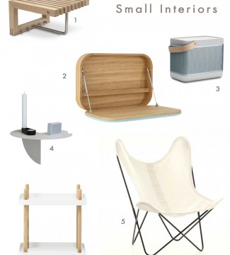
Six Stylish Space Saving Ideas for Small Interiors
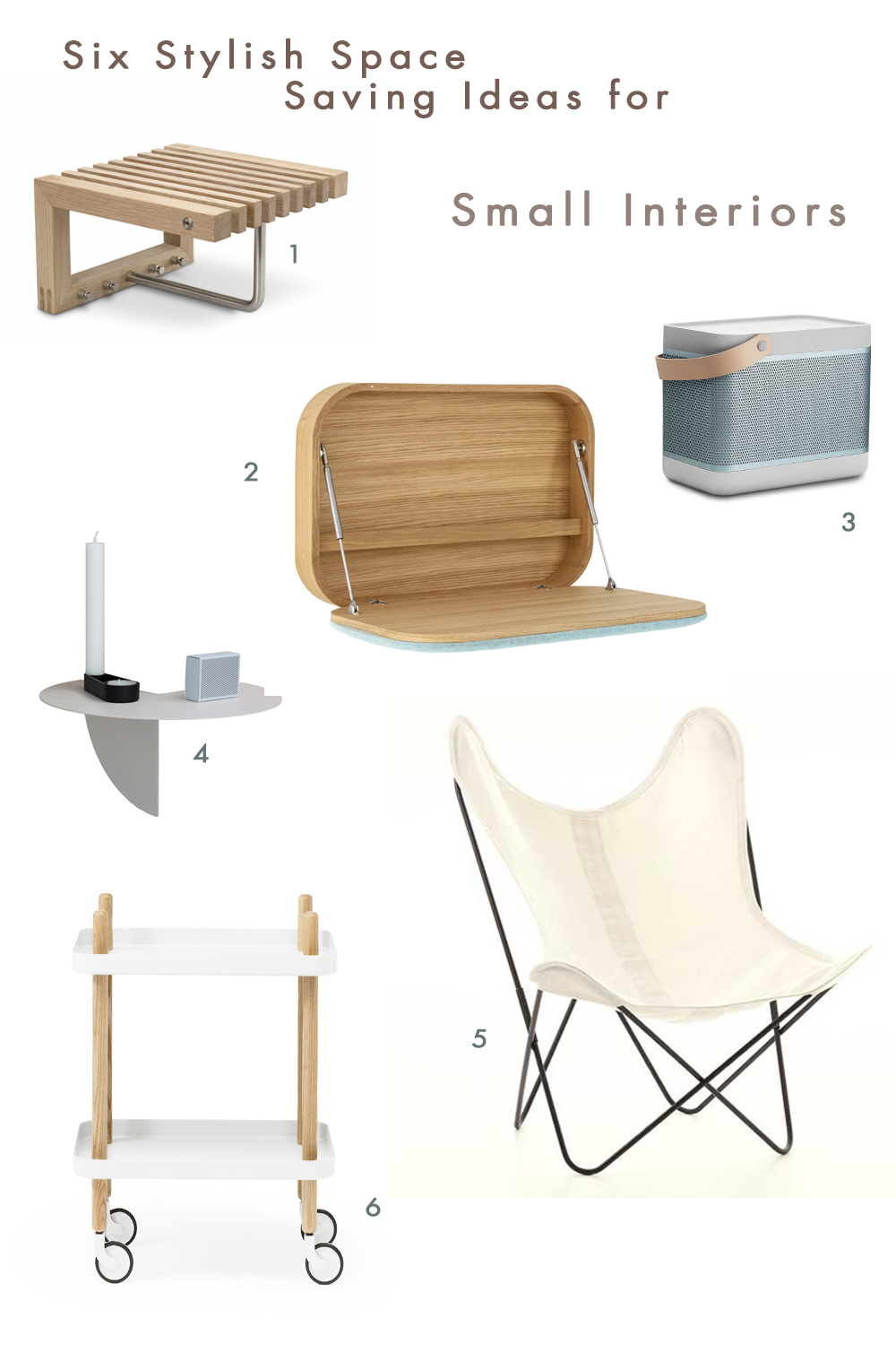
There’s a lot of talk about small living at the moment and it’s a very valid argument in terms of the environmental footprint that we leave. Living in a small home or apartment can be constrictive, so it’s really important to be clever with what you have and use the space well. Ideally things can be multi-purposed, fold away and designed a little outside of the square. Unless it’s a house catering for a family, most people would have similar needs and because you don’t have the space, doesn’t mean that you have to lack in style. I’ve come up with six stylish space saving ideas for small interiors.
Read more on Six Stylish Space Saving Ideas for Small Interiors…
Kristina Dam Studio
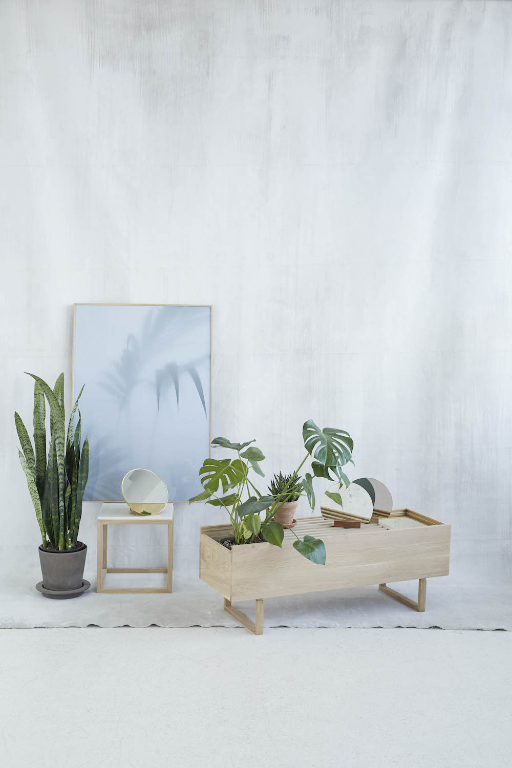
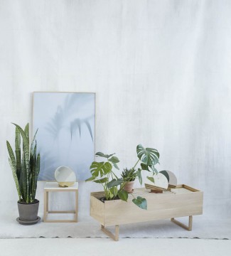
I had one of those moments the other day. I saw an image shared on Facebook by I am the Lab, which took my breath away. The image was of the Botanic Storage by Kristina Dam Studio, a unit designed to place your plants inside or on top, store your magazines, shoes or accessories. The idea and design couldn’t be more perfect for the forever-trending indoor plants.
FURNITURE BY DECADE | 1940’S
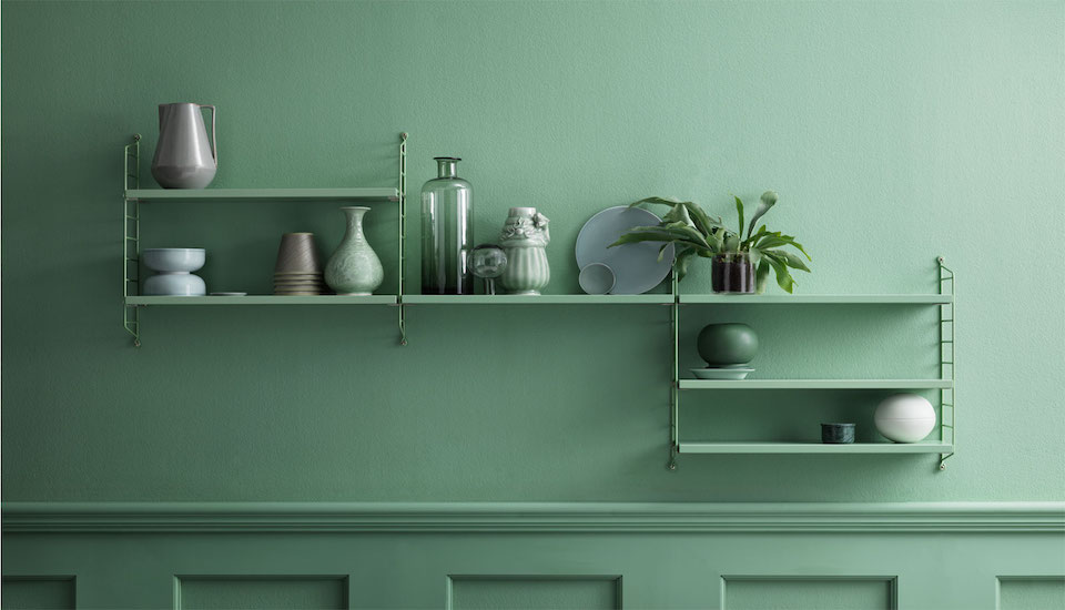
Furniture in the 1940’s was really getting exciting. It was so tough to decide on which items to put here… and to leave out the Eames DCW Plywood Dining Chair, not to mention Hans J. Wegner 512 or 501 or even the ESU (Eames Storage Unit)!!! Okay you might think I’m crazy but I figured, unless I chose, there would need to be a part two for Furniture in this decade. Here I’m covering the incredible diversity of styles and design of this era. Read about Furniture in the 1920’s here.
Furniture By Decade | 1920’s
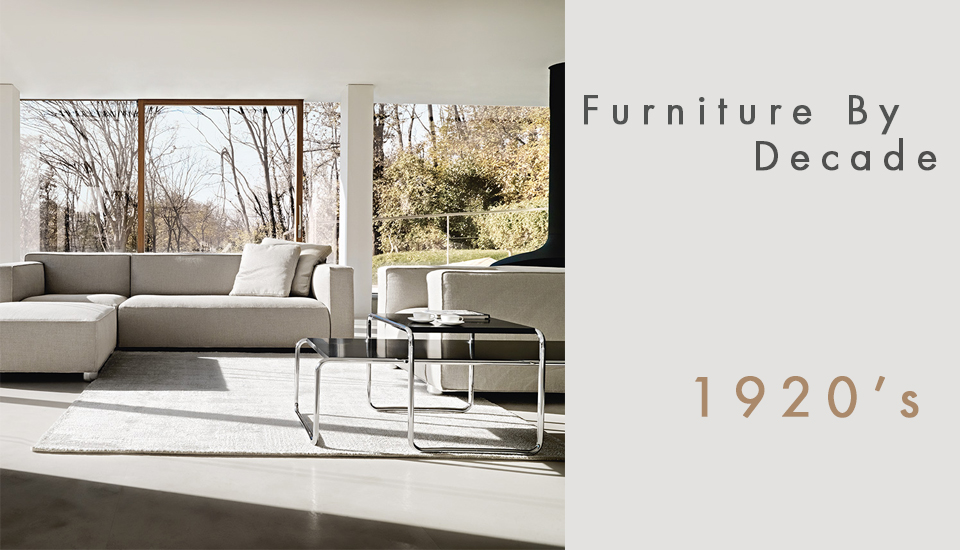
Guillaume bought me this great book the other day on 150 years of furniture design. It’s such an interesting read to see the evolution over the years in one hit. The book inspired me to capture some of my favourites from the decades. Today I’m starting with the 1920’s and typical to the era, it’s not surprising that all of my choices have some form of polished metal in its frame. You can see the full round up at the end.
Alvar Aalto Tea Trolley
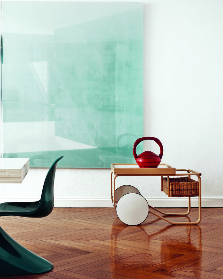
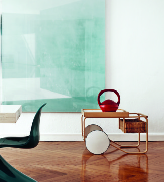
It all started with this image. Everything about it spoke to me, the artwork, the Panton Chair, the herringbone floor, and then of course the trolley. This impeccable piece of design, the Tea Trolley is by Finland’s world-renowned father of bent wood furniture, designer and architect the late Alvar Aalto.
The Cork Roundup
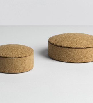
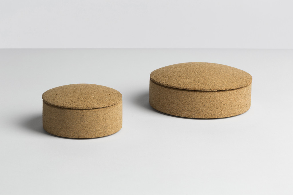 Wrong for Hay Lens Box Stackable cork
You may have noticed that we’ve being seeing cork a lot more in object design lately, especially with some of the main players. It has such a lovely smooth yet tactile feel with gorgeous muted colour tones that it’s really no wonder.
Douglas & Bec – Bedroom
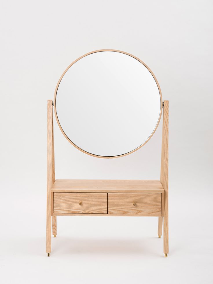
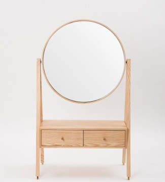
I’m not usually one for sets, I personally go for the mismatched look, but sometimes a design ties in so beautifully together that I question this idea of mine. Douglas and Bec have recently released a bedroom furniture range that is every bit elegant and seamless in its design and workmanship. Of course, each piece would also work beautifully solo.


